SPATIAL INDIA FOR NGO
Find the districts that need you most
Target programs, map impact, and build grant-ready visuals — all from India's most comprehensive district-level data platform. 85+ indicators from Census, NFHS-5, and 10+ national sources, across 800+ districts.
THE DISTRICT DATA PROBLEM
Scattered across portals and PDFs
Census India publishes Excel files. NFHS-5 has its own portal. NJDG is a separate site. Night lights need NASA credentials. Getting district data means bouncing between a dozen sources — none of which talk to each other.
One grant map takes half a day
Your program officer needs a stunting map for three states. That means downloading shapefiles, opening QGIS, joining CSV data, fixing mismatched district names, styling colours — all before a single insight is found.
No way to see patterns across indicators
Which districts have high stunting AND low institutional births AND poor sanitation? Answering that means cross-referencing four separate datasets in Excel. You don't need a spreadsheet — you need a map.
BUILT FOR YOUR WORKFLOW
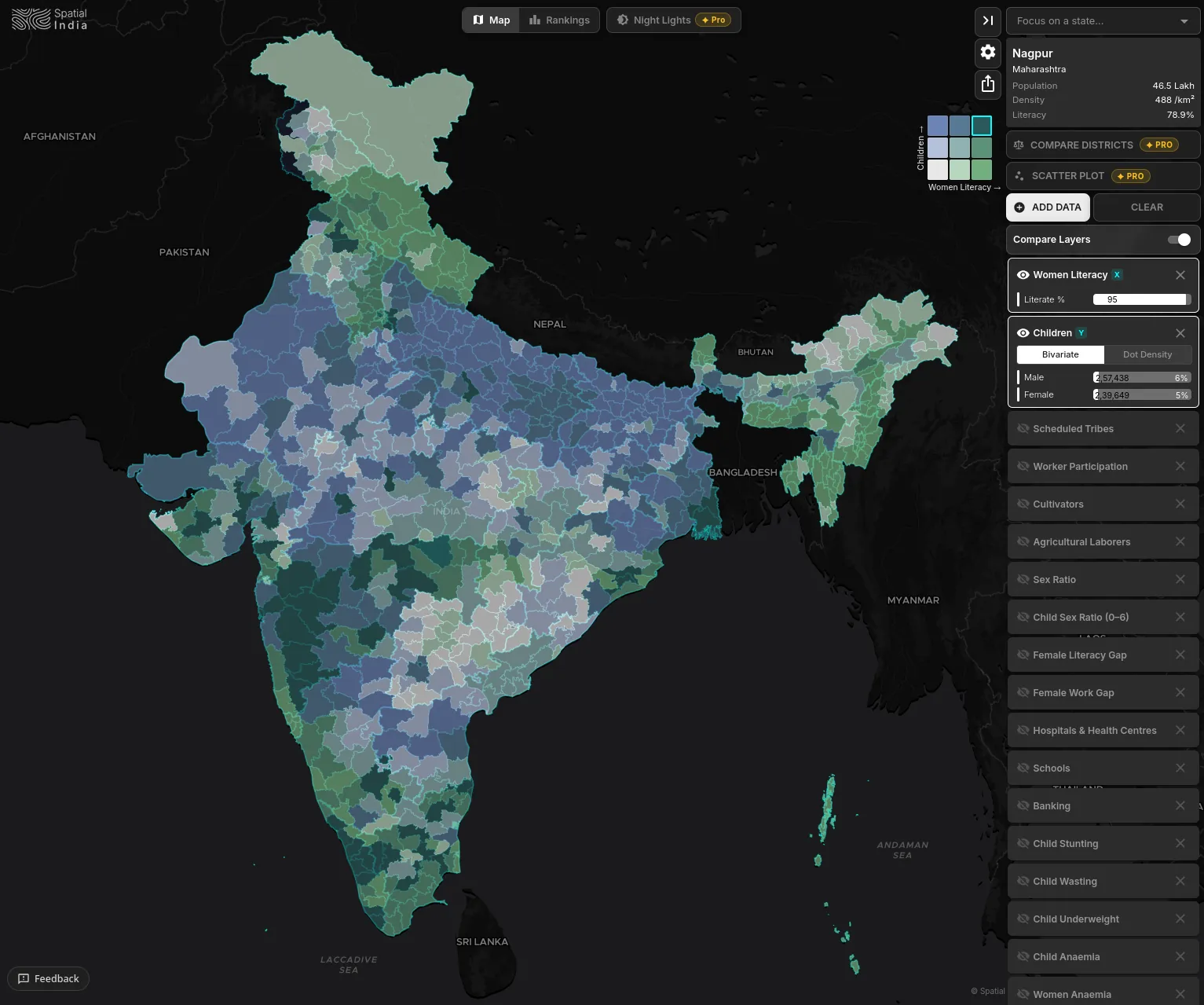
Choropleth Mapping
Visualize any indicator — stunting, literacy, sex ratio, vaccination coverage — across all 800+ districts instantly. One click to add a layer. One glance to see the pattern.
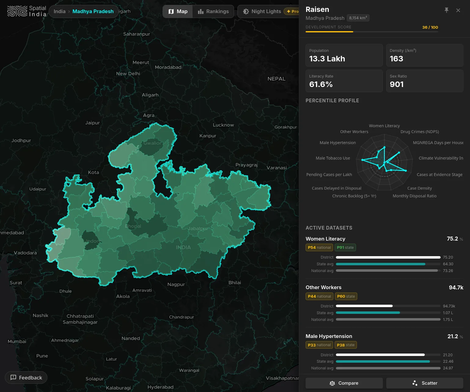
District Profile
Click any district to open a full profile: population, literacy, health metrics, percentile rankings against state and national averages, and a radar chart showing where it stands across every active indicator.
PNG Map Export
Export publication-ready map images with legend, attribution, and source labels — directly into your grant proposal or donor report. No screenshot cropping needed.
District Rankings
Rank all 800+ districts by any indicator. Filter by state. Find the bottom 50 on child stunting, the top 10 on female literacy, or the most underbanked districts in your program states — in seconds.
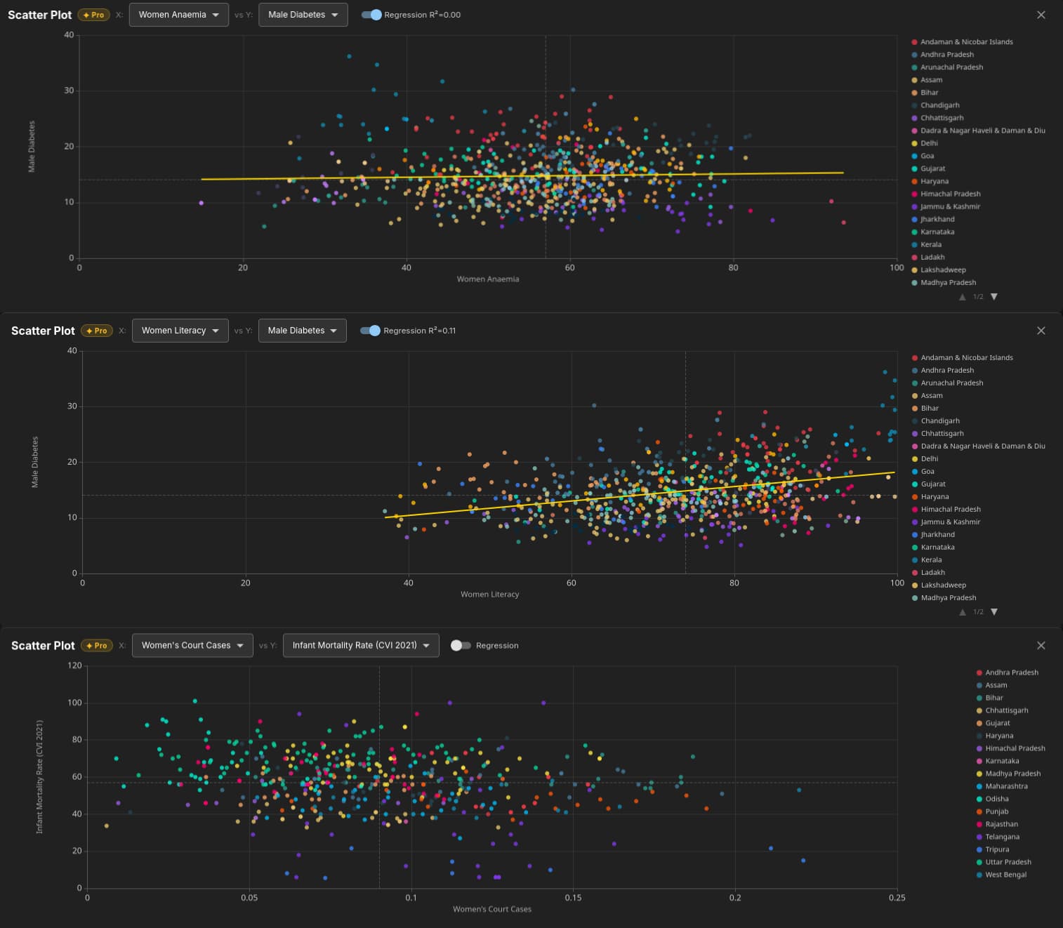
Scatter Plot Correlation
Plot any two indicators against each other to find where expected relationships break down. Which districts have high literacy but poor maternal health? The scatter plot shows you — with regression line and R² included.
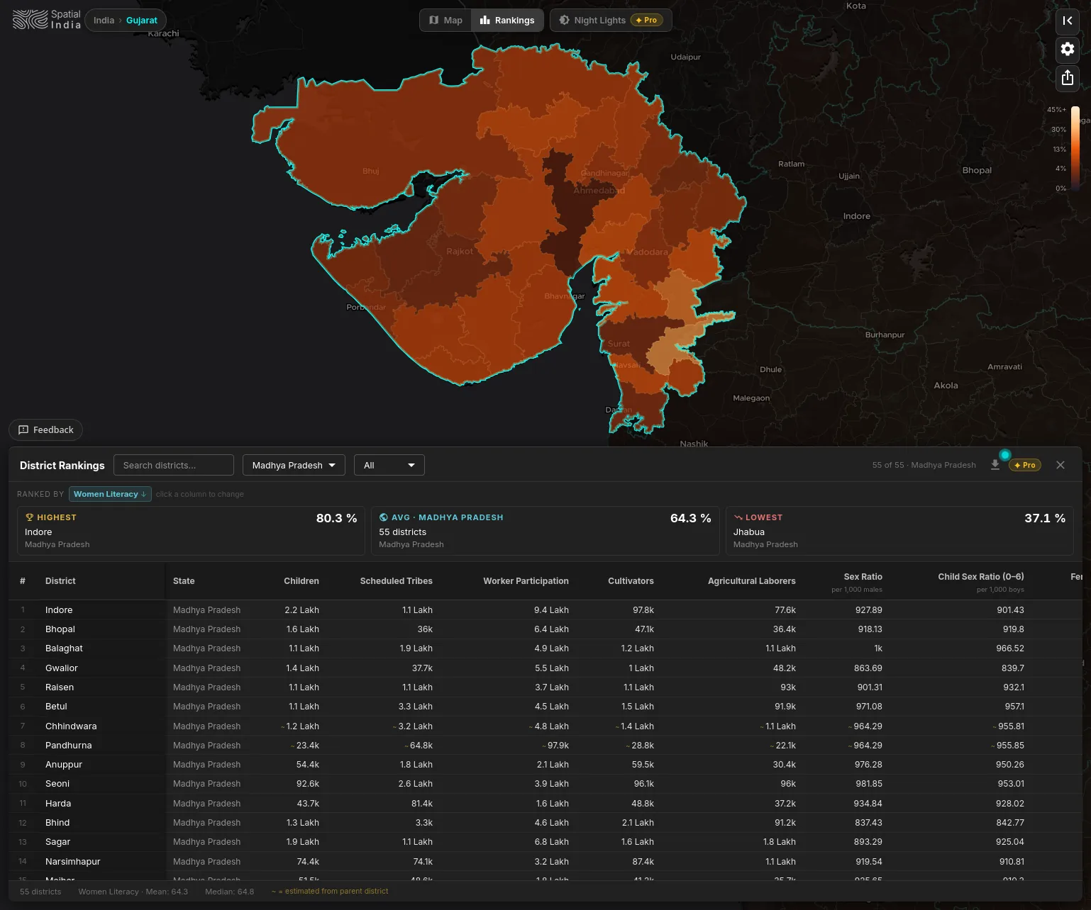
State-Level Rankings
Filter rankings to any state and instantly see which districts lead and which lag — on women's literacy, child health, sanitation, or any indicator. Spot the highest, lowest, and state average at a glance to direct resources where they're needed most.
THE DATA BEHIND YOUR PROGRAMS
WHAT YOUR TEAM CAN DO
Target intervention districts
Pick any health or education indicator, filter by your program states, and rank districts from most to least deprived. Find the 20 districts that need your next intervention — in under a minute.
Build grant-ready visuals
Create choropleth maps showing stunting rates, vaccination gaps, or gender disparities across your target geographies. Export as a branded PNG with full source attribution for your next donor report.
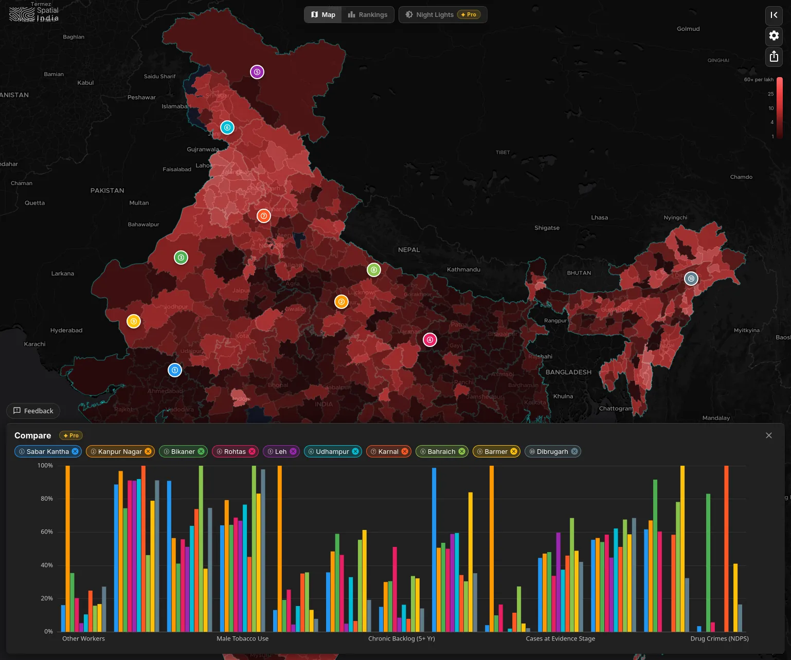
Compare outcomes across program areas
Pin your intervention districts and compare them side-by-side on health, education, and infrastructure metrics. See how they stack up against state and national averages in a single chart.
HOW SPATIALINDIA COMPARES
| Feature | Government Data Portals | Desktop GIS Tools | Research Data Platforms | |
|---|---|---|---|---|
| Interactive district-level maps | One-click, any indicator | (hours of setup) | (basic) | |
| 10+ national datasets, unified | Census, NFHS-5, crime, lights & more | |||
| Works in your browser, zero setup | Open your browser and start | (scattered across portals) | (complex interface) | |
| Cross-indicator analysis | Built-in scatter plots & correlation | (requires expertise) | ||
| Side-by-side district benchmarking | Pin up to 10 districts, compare instantly | |||
| Grant-ready map exports | PNG with legend & source attribution | (manual cartography) | ||
| District ranking & prioritization | Rank 800+ districts by any metric | |||
| Census 2027 ready | Architecture ready, day-one support |
Spatial India vs Government Data Portals
Spatial India vs Desktop GIS Tools
Spatial India vs Research Data Platforms
Your districts are waiting
Free to explore. No account, no login, no GIS skills required. Start with the indicator that matters most to your program.